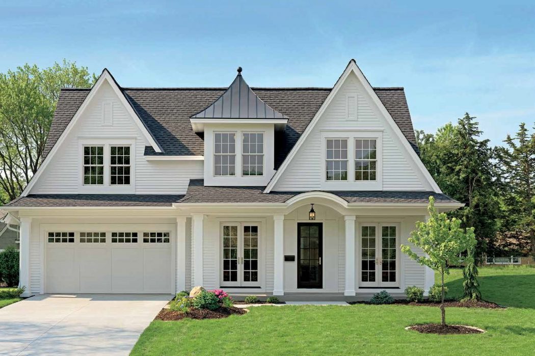
Everyone knows how important curb appeal is when trying to sell a home, but a pleasing façade and landscaping are equally integral to enjoying the house while you’re living in it.
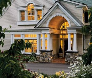
A home’s allure is as much about scale and proportion as it is about the little touches such as a cobblestone pathway lined with blooming perennials or a crisp new American flag swaying on a mahogany flagpole.
Architects and designers follow a few basic principles to boost a home’s street-side presentation, regardless of personal preferences and style. Appropriate scale and proportion, including properly situating the structure on the lot, and selective use of quality exterior materials will not only elicit oohs and ahs from passersby but also give the homeowner a sense of pride and satisfaction every time she or he pulls into the driveway.
STREET-SIDE SENSATION
Before mapping out a plan for a new home or renovating an existing home, architect Andrew Reck of Oak Hill Architects in Weston, Massachusetts, surveys the site to determine the home’s approach. “It’s critical that a home’s scale is fitting, seems inviting and relates well to surrounding buildings,” he says.
Patrick Ahearn, owner of Patrick Ahearn Architect in Boston and Edgartown, Massachusetts, agrees that a home’s appeal begins with scale, alluding to what he calls “the greater good theory.” With a nod to the McMansion phenomenon of the early 2000s, Ahearn stresses the importance of respecting the scale of other homes in an existing neighborhood while considering how the house’s orientation will affect its appearance.
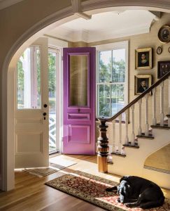
Proportion comes into play when selecting the size of prominent features, including windows and doorways. “Windows are one of the most defining characteristics of a house and its curb appeal,” observes Timothy M. Giguere, project architect and technology manager at TMS Architects in Portsmouth, New Hampshire.
Quality windows can enhance interior light patterns and maximize the view while meeting the proportional needs from an exterior perspective. Marvin Windows’ eye-catching exterior clad window sashes allow homeowners to sit back and enjoy the view from wood-trimmed interior windows. “With clad sashes on the exterior only, the look isn’t compromised but the client benefits from better performance and deferred maintenance,” Reck says.
Giguere enjoys Marvin’s extensive product line, often settling on different colors for the window sashes and trim for a unique look. A favored combination is a cranberry sash, sage trim and taupe shingles. “The colors add depth and play off each other, making the window more of an architectural element,” he explains.
At Birdseye Design in Richmond, Vermont, architect Jeff McBride’s clients are in the market for aesthetically pleasing customizable windows that stand up to climate demands. In Vermont, he says, “the landscape dictates much of the work we do, and the climate requires that we’re always paying attention.”
Battling cold, ice and snow in the winter months, and humidity in the summer, New England has its challenges. “Materials must pass durability standards first and foremost,” McBride says. As for materials that stand the test of time, he lists cedar and Corten steel right up there with Marvin Windows.
FAÇADE FACTORS
A welcoming approach to a well-maintained home is sure to grab the attention of all who pass by, particularly those with an invitation to enter. A prominent entry, whether formal or informal, is one way to warmly greet guests. “The main entrance should feel welcoming,” Reck adds. “We add features to highlight the entry so there’s no confusion on how to enter the home.”
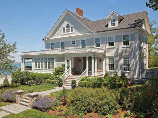
Ahearn suggests adding a gate or arbor that sets up the shift from the public to the private realm, ushering guests to the main attraction. Other elements worth the investment, in Ahearn’s opinion, are stone and brick veneer foundations, wood and slate shingles, blue stone steps, copper flashing and wood gutters. “Everything you touch, feel and see should be selected to enhance the home’s curb appeal,” he says.
A WORK OF ART
New England residences are often built to celebrate and reflect their surroundings. “Homes in Vermont are turned and rotated depending on the topography and layout of the property,” McBride shares. “The landscape is always present so our buildings need to fit in instead of interfering with the area.”
As such, architects at Birdseye Design emphasize the connection of a house to its landscape, whether that’s opening the house to a river, mountain or lake view. “We design house concepts that celebrate the landscape in a unique way,” McBride says.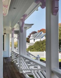
Giguere encourages clients to visualize how the texture of the space, the color of materials, and the types of patterns being created will vary throughout the year. “Architecture is a piece of art that is seen during different seasons and at different times of day,” he shares. “It can be inviting in the spring but cold in the winter depending on the color palette and materials used.”
Tying all of a home’s elements together into one cohesive vision is perhaps one of the biggest challenges. “Sometimes that means letting a few things go, no matter how much you want them,” Giguere mentions. “Less is definitely more when it comes to a home’s features. A trained eye can help steer clients in the right direction.”
Written by Rebecca Mayer Knutsen. Top photo by Paul Crosby. This story originally appeared in New England Living magazine.

