Four room designs that are anything but dull.
Written by Janice Randall Rohlf
Neutrals are often called upon for their ability to achieve a calm, clean look. Was that a yawn? Before you dismiss beige as boring and white as wimpy, think about how layering in a wide range of tones, textures, and shapes can keep a neutral room from ever feeling sleepy. All of these elements used strategically provide the contrast and tension necessary to spice up a tone-on-tone palette without adding a big splash of bright color.
“People often want to keep the big-investment pieces—tilework, tub, shower—neutral and have a bit more fun with elements that can be changed out over time, like a countertop, faucets, or light fixtures,” says NCIDQ-certified designer Eric Madsen, district showroom manager of Kitchen & Bath Galleries at Supply New England. Here, with Madsen’s input, we deconstruct four neutral living spaces to see what makes them exciting.
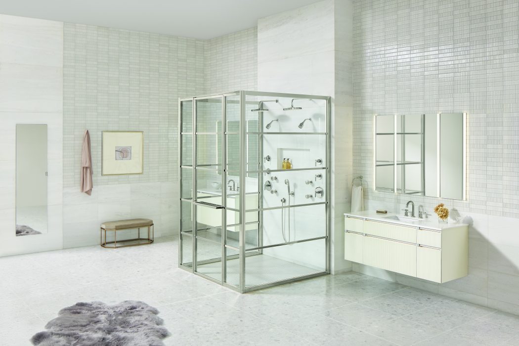
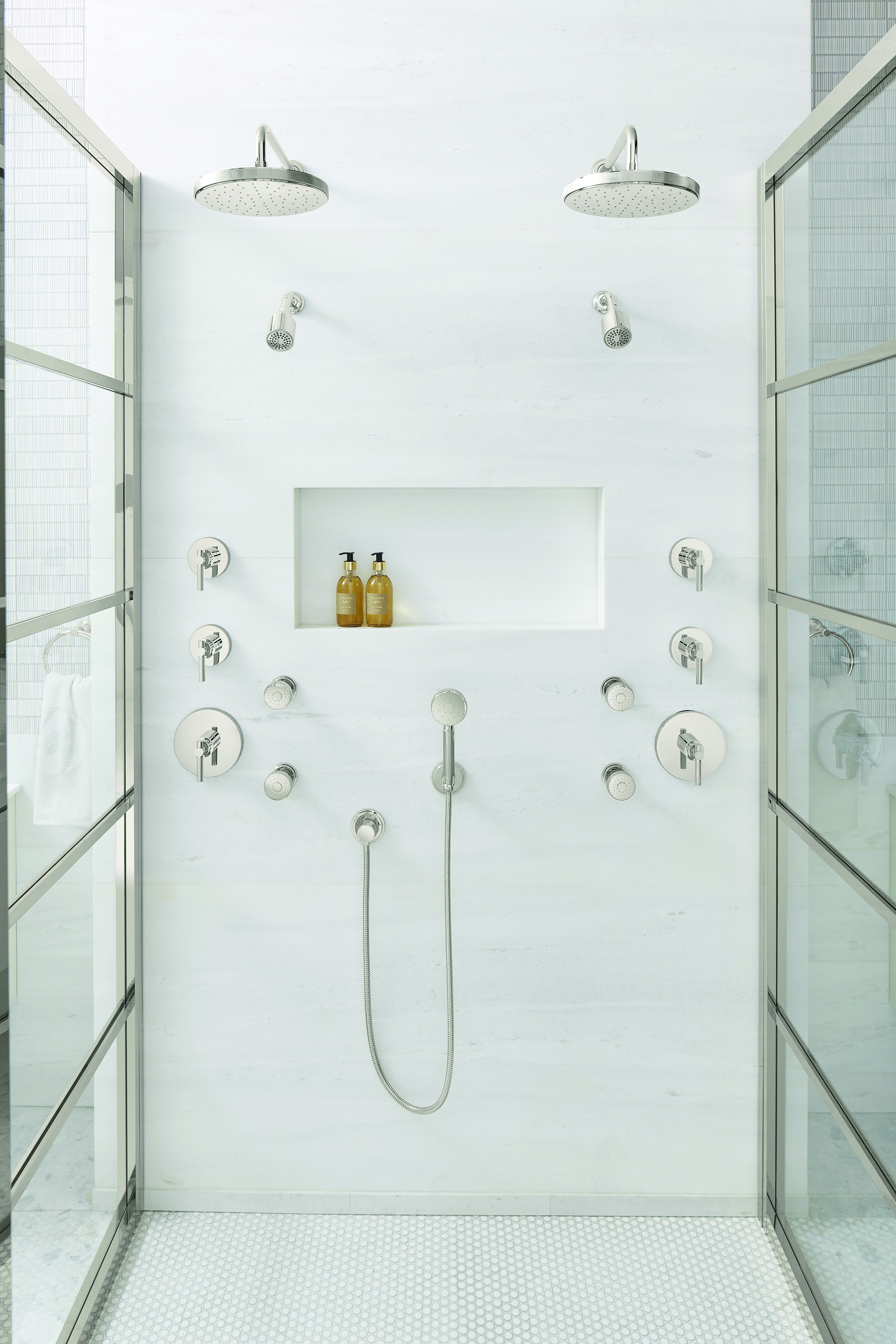
Timeless
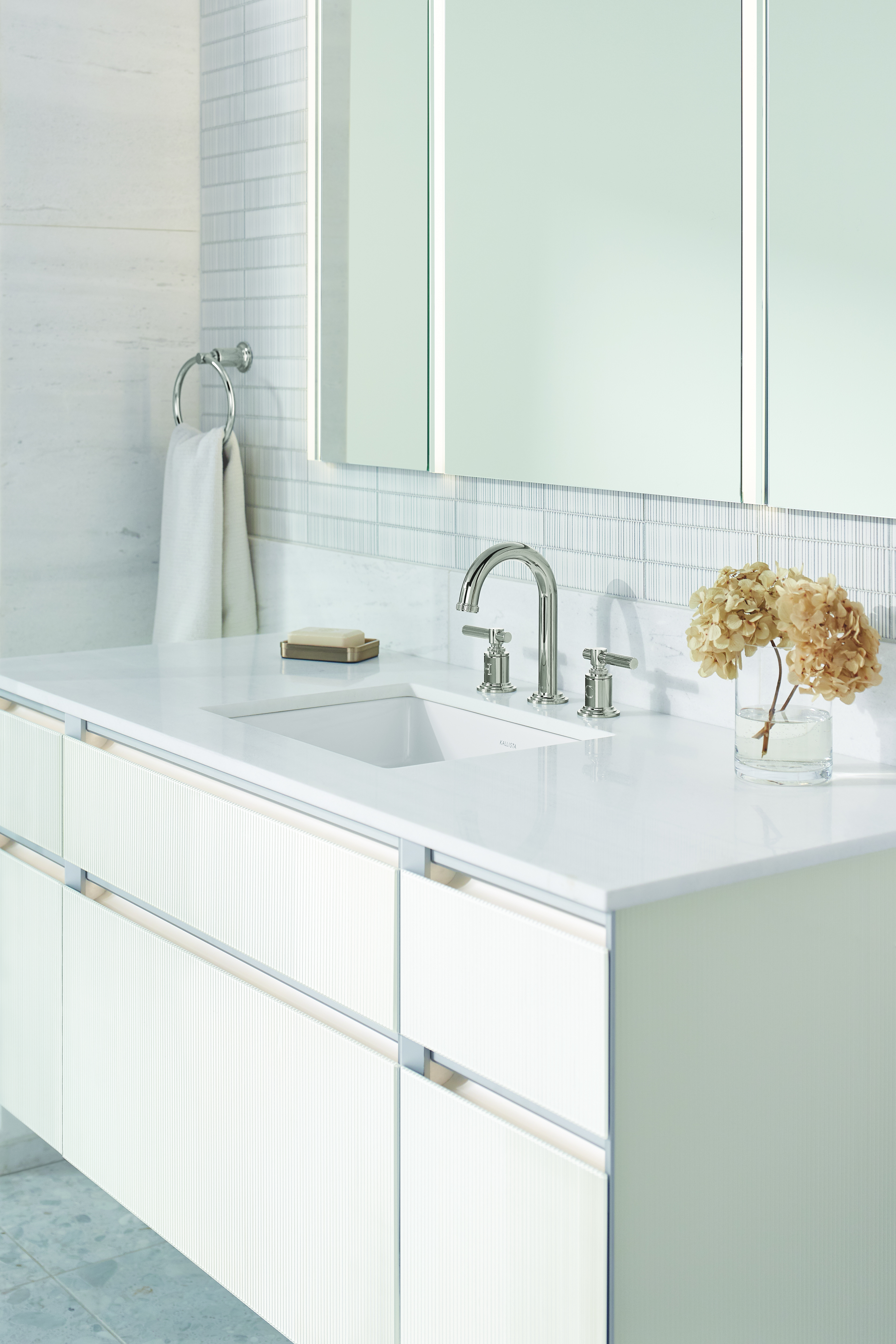
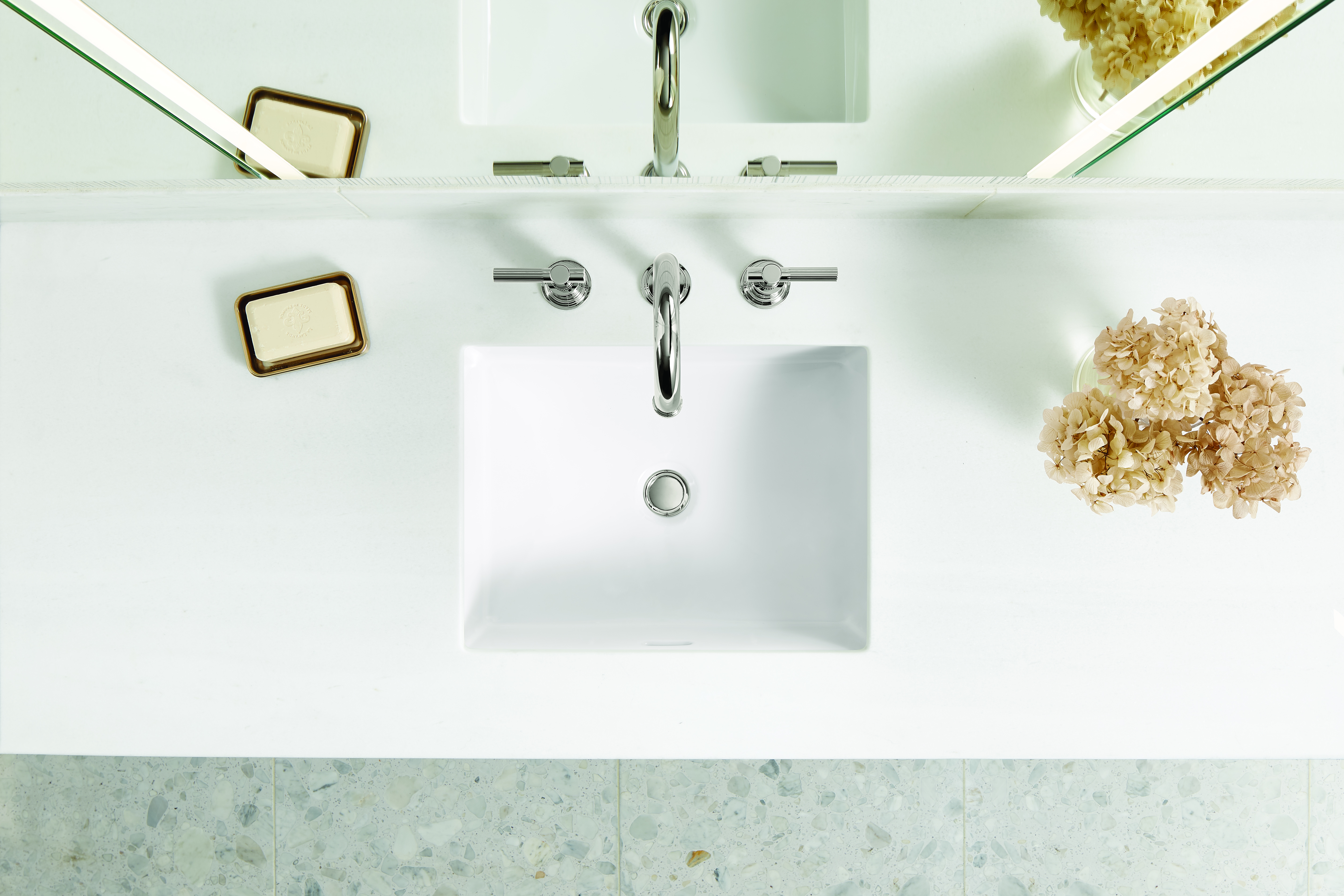
COLOR: The color palette is a combination of different neutrals, with white predominating. To keep things interesting, there are warmer whites in the vanity and some cooler whites coming through in the tile.
TEXTURE : The reeded glass on the modular floating vanities introduces the understated beauty of simple, repeated form. The vertical lines of the reeding contrast with the vanities’ horizontal detail, adding dimension and depth to the room. The reeding in the glazed ceramic tiles enhances the textural complexity.
SHAPE: Playing with linear lines, the vanities, with a horizontal drawer bank, are set on a wall tile that is also horizontal but whose rectangular shapes are a little bit larger. Above that, the reeded wall tile cut in smaller rectangles lends proportional balance, while the metalwork on the shower brings larger format rectangles into the mix. The rectilinear shape of the mirrors is accentuated by the lighting in each pane.
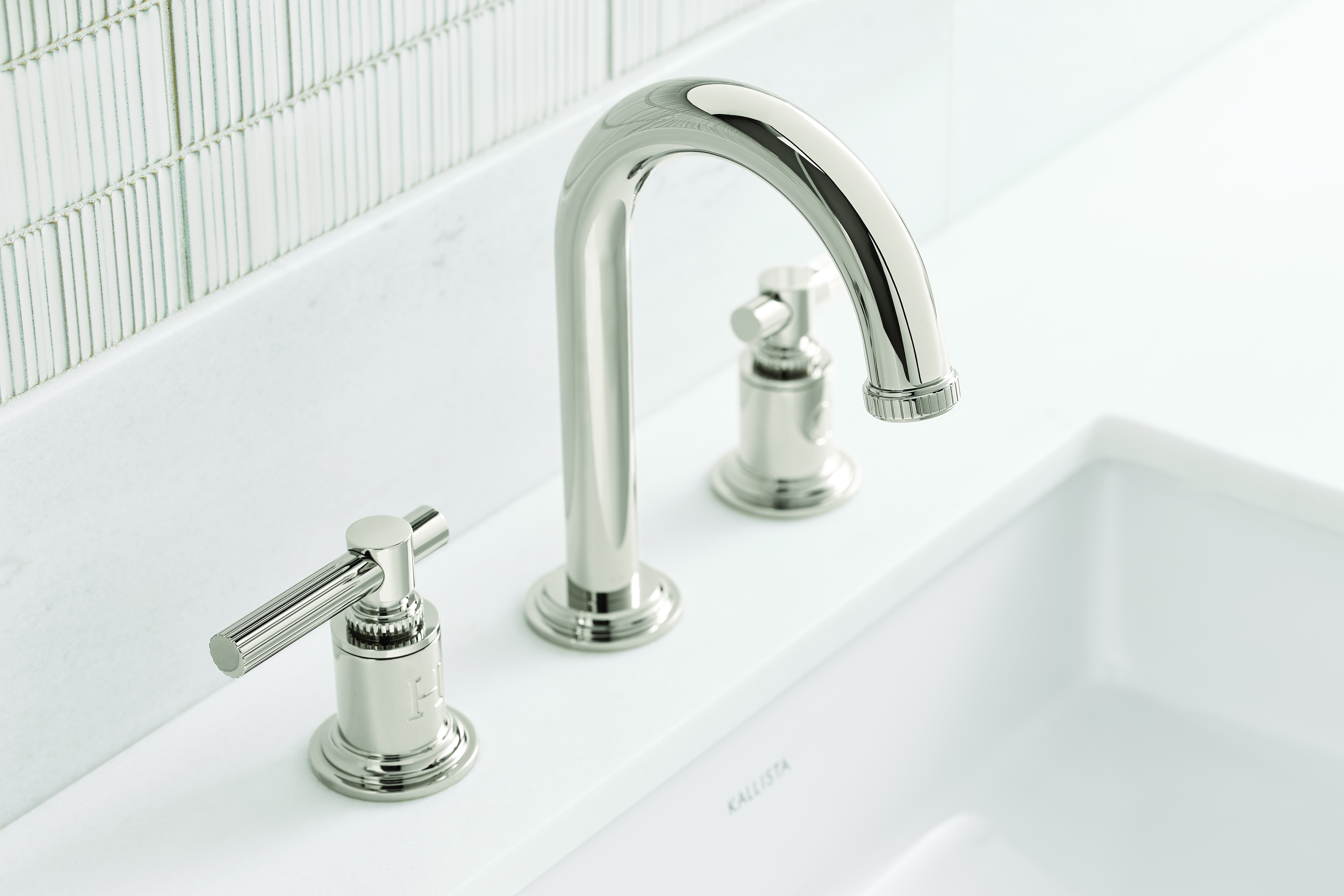
METALLIC TOUCH: In polished nickel with clean lines and subtle details, the Central Park West collection from Kallista is a timeless look that also betrays some Art Deco influences. The fluting and the engraving of “H” and “C” on the faucets are an updated riff on the ceramic faucets common in traditional New England homes.
Contemporary
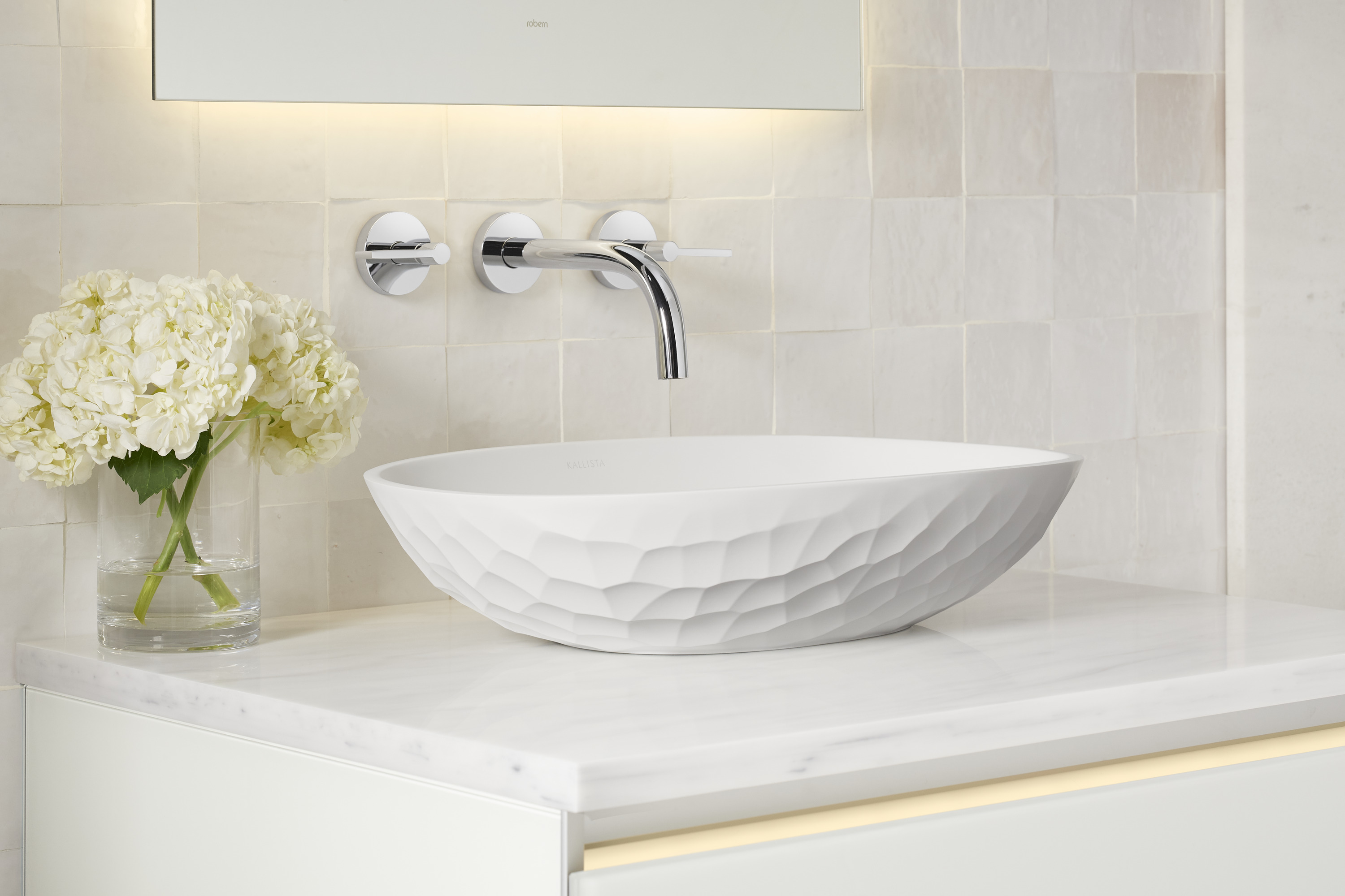

COLOR: Whites with subtle variations in tone and a mix of sheens bring this neutral room to life. The clean-white matte finish of the tub and vessel sinks contrasts with the warmer white reeded glass on the vanities.
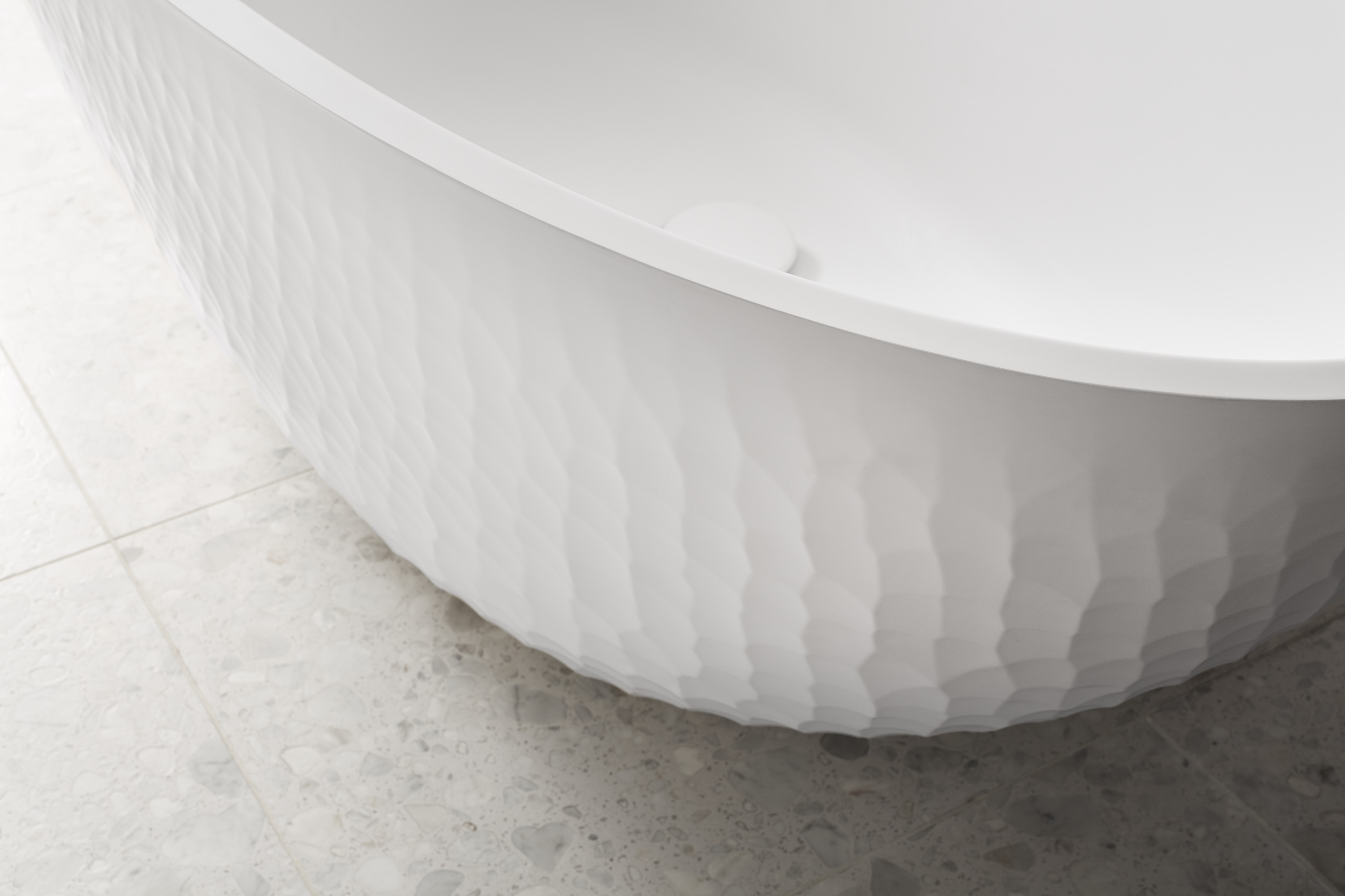
TEXTURE : Chosen for their handcrafted aesthetic, the tub and sinks resemble wood cuts and tooled clay, with dimpling that captures light beautifully. The natural feel of honed stone is echoed in the 3-D wall tiles. Throughout, texture provides warmth and interest.
SHAPE: The sculpted, undulating modern shapes of the tub and sinks provide visual intrigue to the pared-down color palette.
LIGHTING: Here, the light warms up the large amount of white and off-white tile. In addition, the illuminated mirrors create different layers of lighting, which in turn add depth to the room. The illuminated drawer pulls within the vanities bring yet another layer of lighting—another bit of warmth—to the space.
Glam
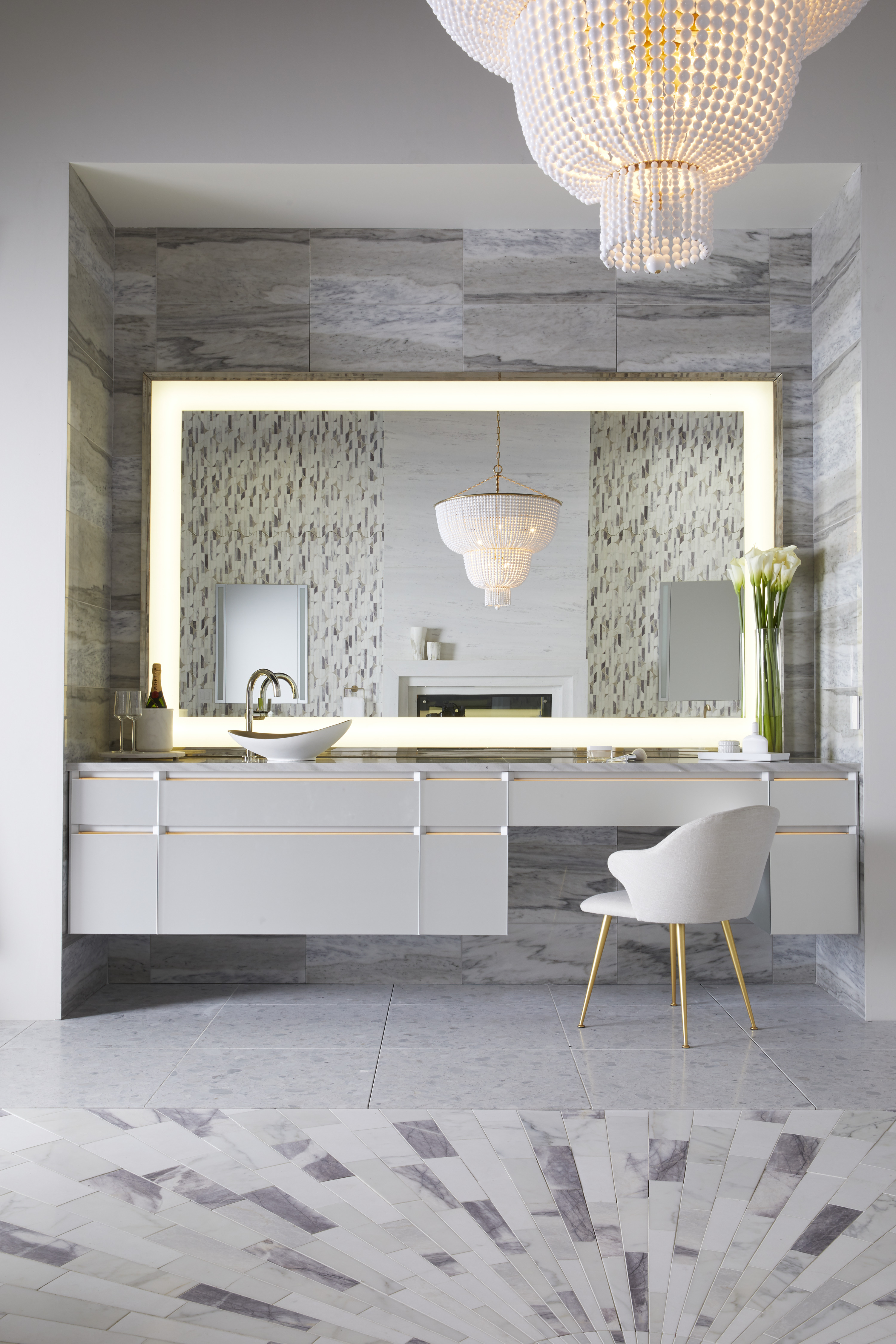

COLOR: Although still considered a neutral palette, this room’s full spectrum of grays in the tile gives it personality without overwhelming the space. The statement wall behind the mirror provides pretty contrast.
PATTERN: Along with the gradations of color, the dynamic starburst feature in the floor tiling increases interest at ground level, giving the room a slightly elevated aesthetic.
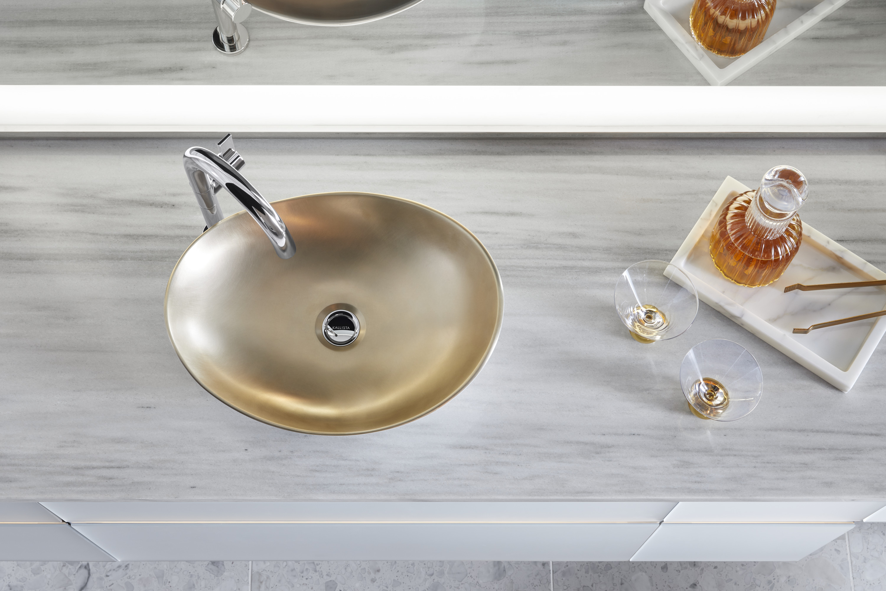
SHAPE: The elliptical form of the decorative vessel sink gives it the look of a piece of sculpture, which is further enhanced by the matte white finish on the underside. Stark white walls contrast the room’s multiple patterns to draw the eyes upward toward the beaded chandelier, notable for its tiered shape.
MIXED METALS: Glitzy finishes give a neutral bathroom a luxe look. The gold-tone satin bronze finish on the sink pairs well with the spout’s polished nickel finish, which has a warm undertone. The gold of the sink is carried through further by the chair legs and the chain on the chandelier.
Transitional
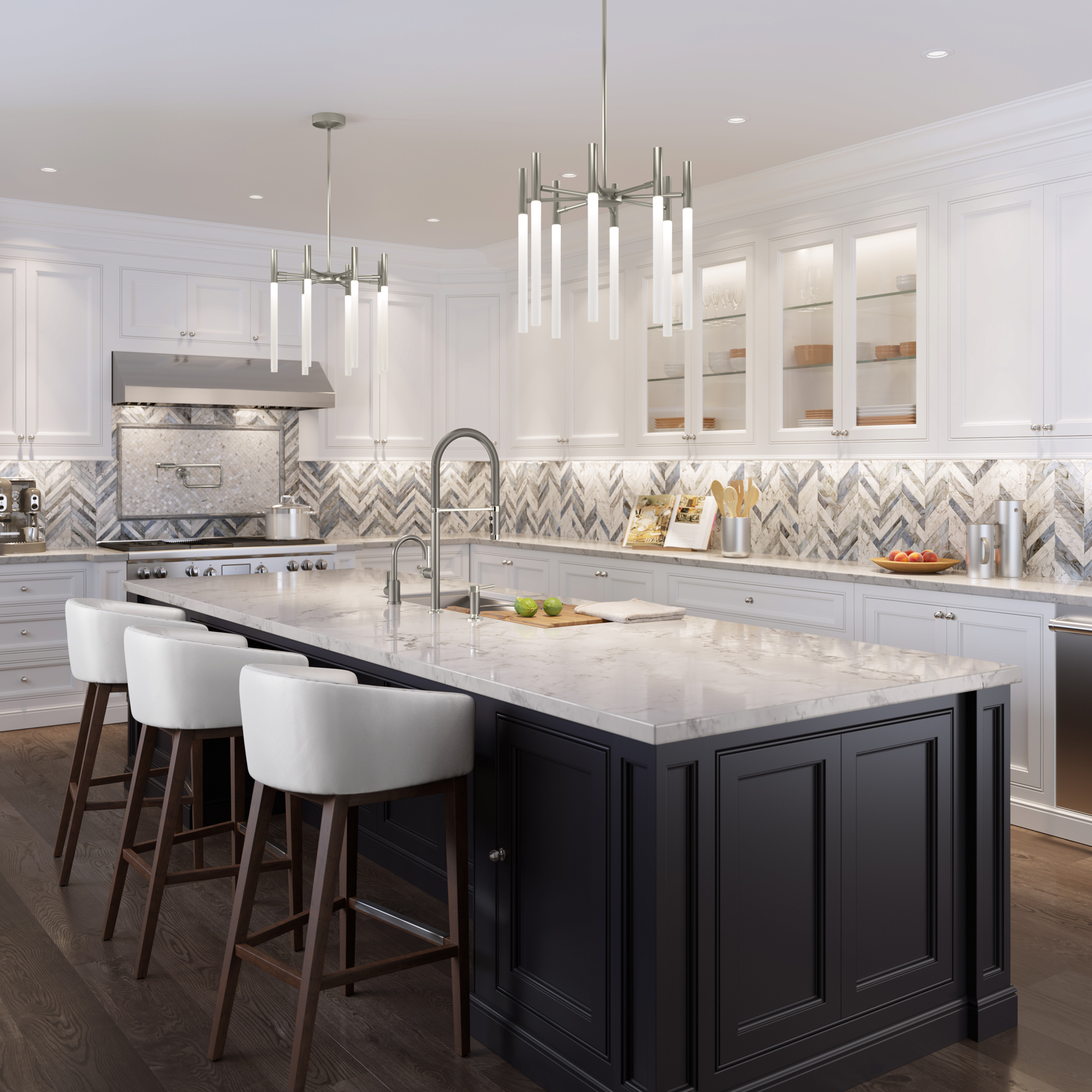

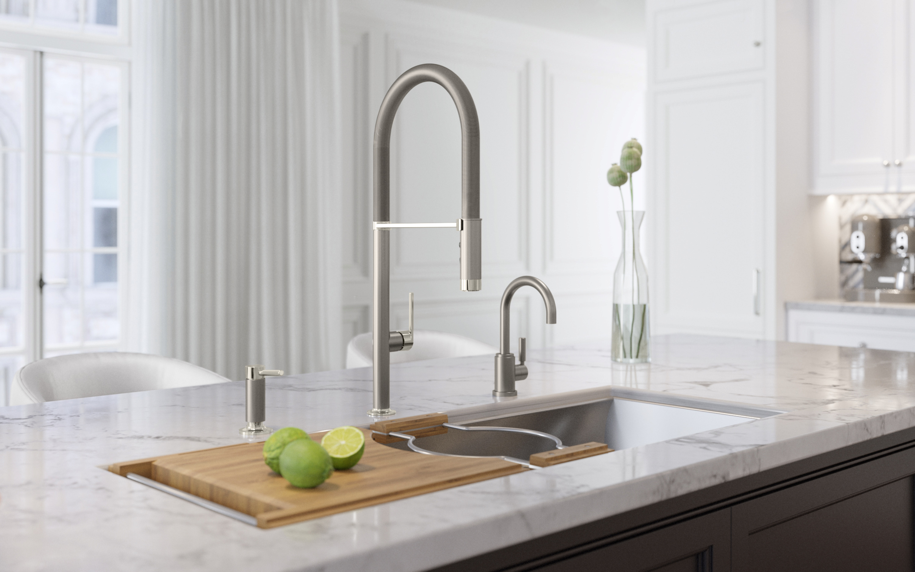
COLOR: Shades of beige aren’t the only option for a neutral color scheme. Here, a pretty slate blue runs through the chevron backsplash. Its cool nature is offset with warm wood floors and bright white perimeter cabinetry. Blues that tilt toward gray can serve as a neutral. The strong island color helps temper the bright white used in the space.
MIXED METALS : The two-tone sink hardware—polished nickel and stainless steel—serves as a bridge piece to other metal in the room, including the pot filler and the chandeliers. The backsplash, with its tones of cool blue, warm gold, and brown, helps tie the metals together as well. The silver-gray finishes on hardware and fixtures act almost as an accent color.
PATTERN: The angular lines of the chevron patterned tiles are echoed in the minimalist chandeliers, bringing a contemporary counterpoint to the traditional beaded inset cabinetry.