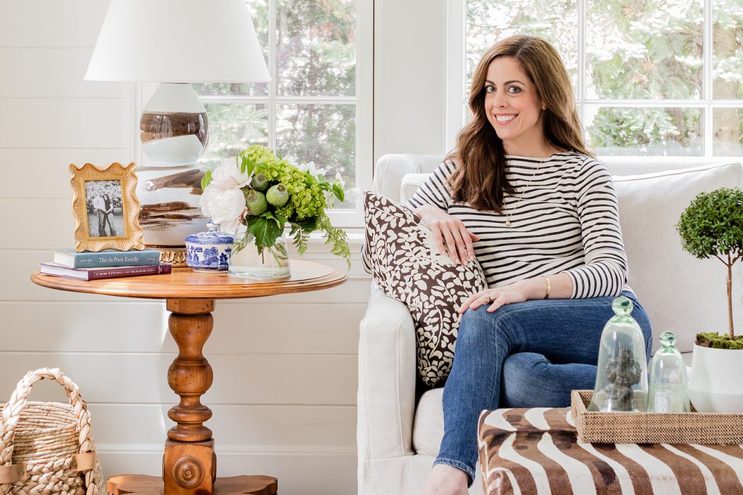
Bestselling author and award-winning designer Erin Gates shares her expertise on making a house a home.
Interview by Robert Cocuzzo Photography by Michael J. Lee & Sarah Winchester
Erin Gates never could have imagined what was to come of Elements of Style when she launched the design blog in 2007. More than a decade later, Gates is a New York Times bestselling author, an award-winning designer and the owner of an eponymous design firm with products and projects spanning coast to coast. Today, the Newton resident and mother of two is quickly ascending into the ranks of the Bunny Williamses and Martha Stewarts of the world. Most recently, Gates gave birth to a new baby boy and was able to answer some design questions while enjoying her maternity leave.
How would you describe the quintessential Erin Gates design?
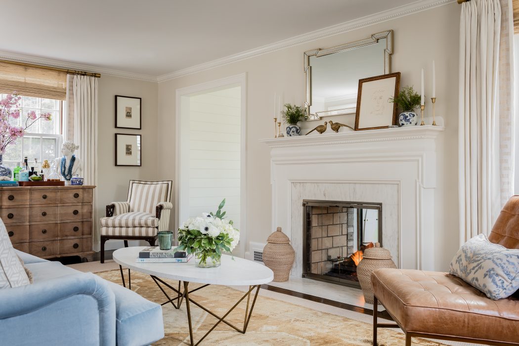
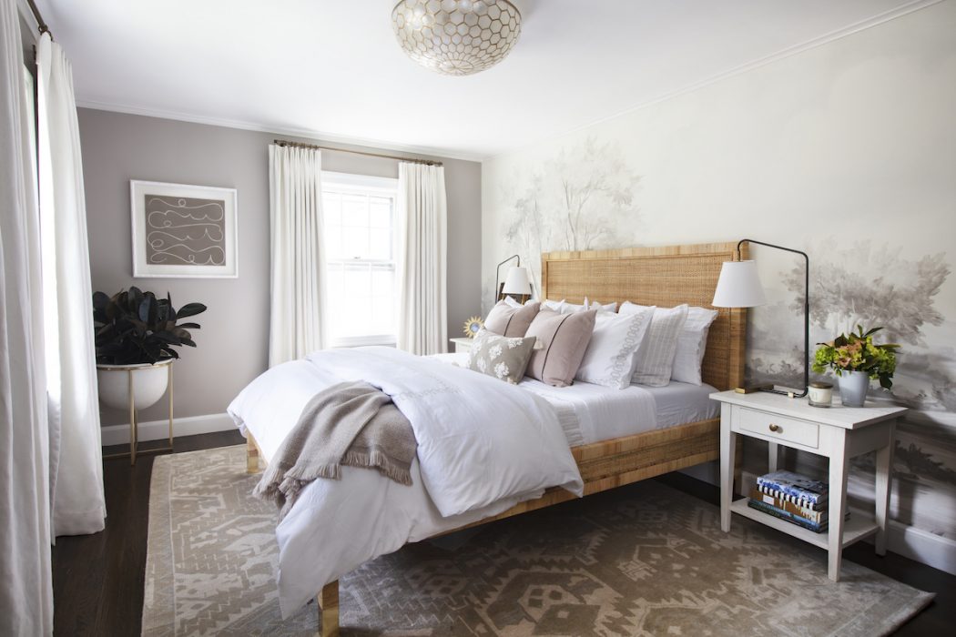
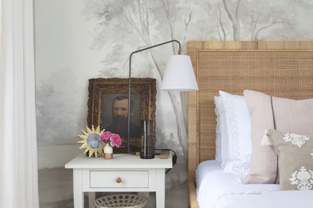
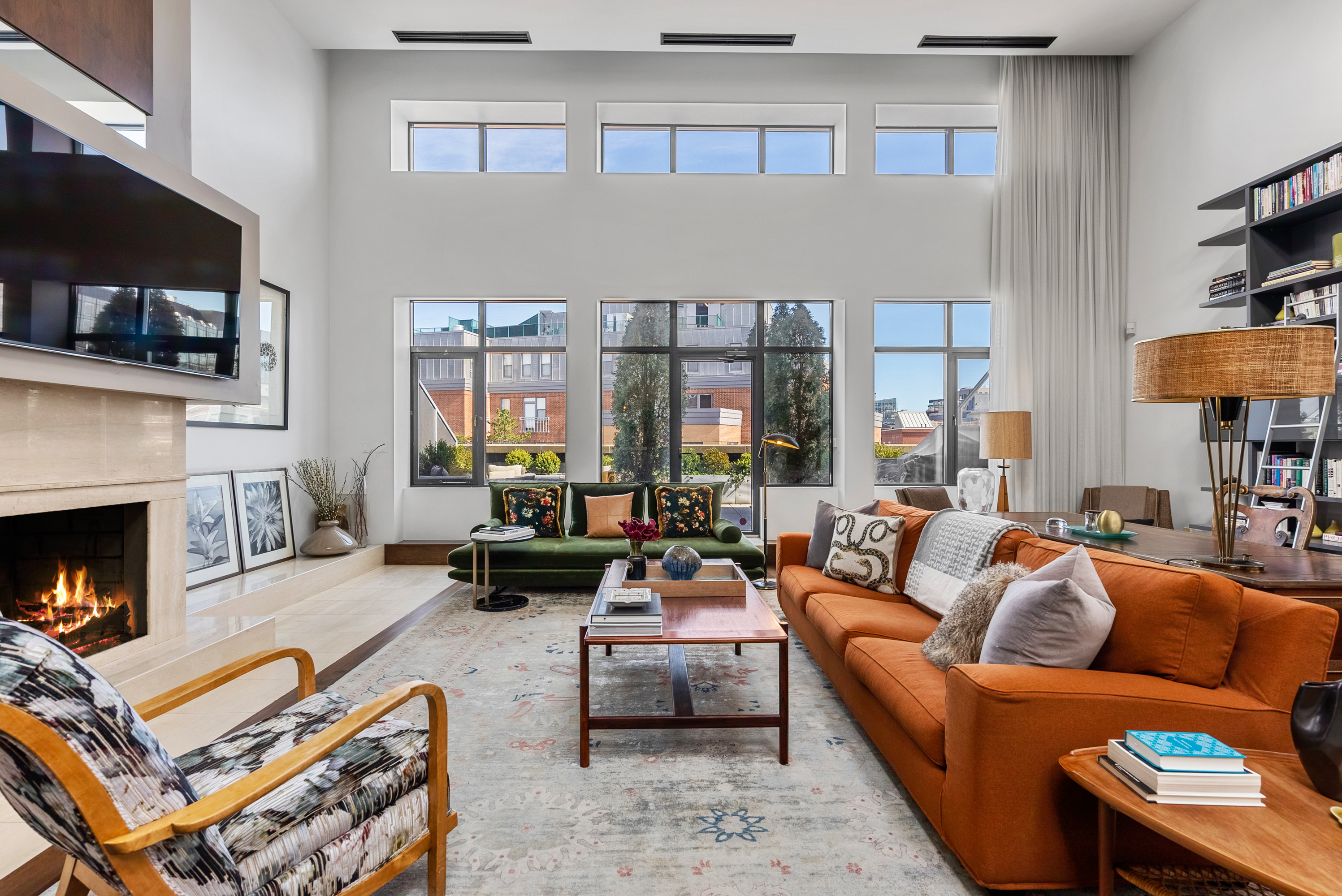
I’d like to think there is no telltale signature of my designs in that they look very individual to each homeowner. However, I always like to combine traditional, classic design with modern touches and always incorporate some antiques or vintage items with patina. I like a space to feel warm and personal, not like a hotel.
When you’re designing a space for someone, what are the three most important questions you ask them to gather the look and feel they are seeking?
The most important thing is for them to provide inspiration imagery with notes so we know what about each image they like—the more, the better in my opinion. Second, I like to ask them what they don’t like, which is important so we don’t waste time picking fabrics in colors or patterns they dislike but perhaps did not voice an opinion on otherwise. Third, I ask them how they want the space to function and feel—function being key. The space needs to work for their lifestyle and family as well as look beautiful.
For someone working with a limited budget, what are three simple things they can do to dramatically update a living room?
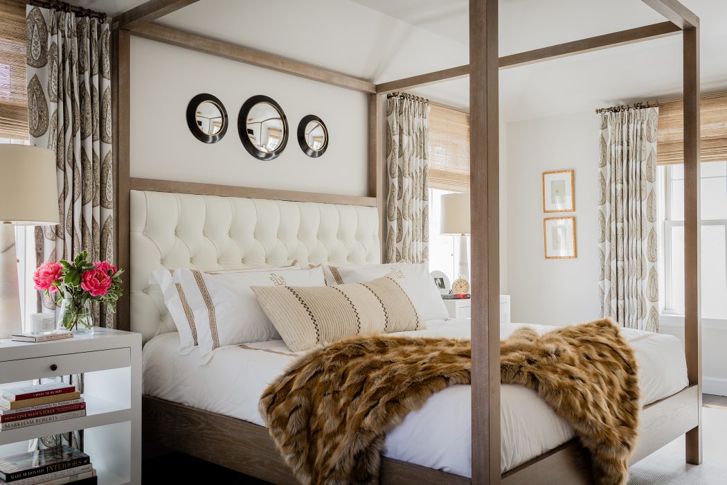
Paint—it’s the most dramatic way to change a room for less. Either to brighten it up, make a statement with something moody or do something a little different like paint the trim a contrasting color. Second, a large, properly sized rug—doesn’t have to be expensive, a simple jute that fills the room can make a big impact! Finally, window treatments—IKEA has some good, basic panels. Hang them high to the ceiling to make the ceiling seem higher and hem them with hem tape or have a local dry cleaner hem them! They’ll look tailored to your space, which looks expensive.
What is an interesting trend you’re seeing emerge in today’s design world?
I love the whole granny-chic thing happening! I never thought I would, but I am embracing the flouncier trims, florals and darker woods.
What is one trend you’d like to bring back and one that you’d never want to see again?
I’d like to bring back houses with rooms. I am pretty sick of all the super open-concept new builds I see. I like a house to have defined rooms and some separation. I would not like to see balloon shades come back in style. And I still hate terrazzo, no matter how many magazines tell me it’s cool.
What’s your strategy when designing a kid’s room?
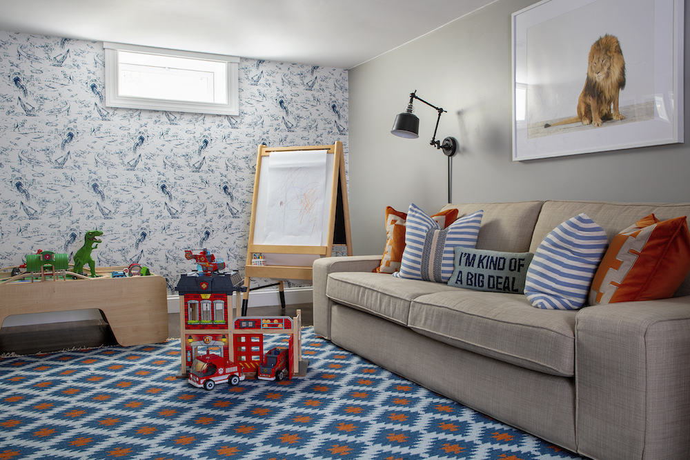
Design so that the room can transition as they age. For example, pick a rug and wallpaper or wall color that is ageless. The accents can change easily as their tastes change. My son’s room has a great Hinson wallpaper and antique Persian rug, and everything is tones of red and blue. Today, it’s coordinated with his love of Captain America. When he’s 10, who knows! But red and blue are such classic colors, it’s bound to still work.
Is there an unsung design element or accessory that can help achieve a unique aesthetic in a bathroom?
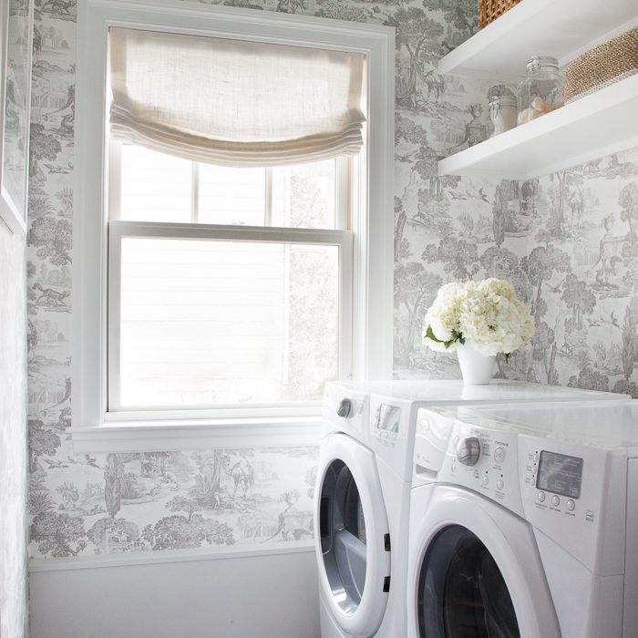
Great window treatments really help add softness and pattern to what is typically a “colder” room due to all the hard finishes. Patterned sheers can be a fun way to provide privacy but add interest.
Turning to kitchens, what new innovations have you been integrating into your projects?
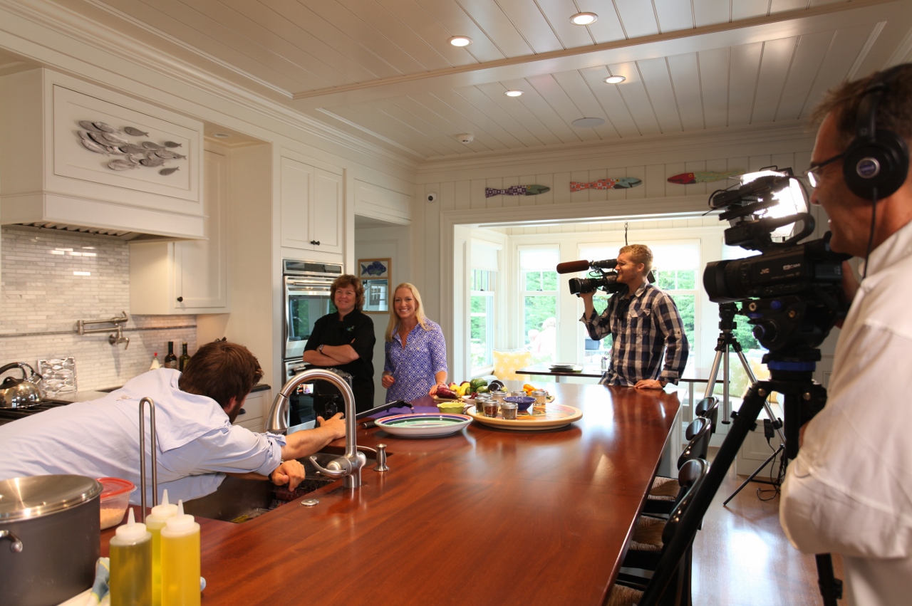
I’d say people are wary of incorporating too much new technology into a kitchen as technology ages and breaks, so we stick with classics. Faucets with handles and such. People are actually going retro instead—French ranges with no glass doors, paneled appliances and farmhouse sinks. And everyone has seemed to come around to brass plumbing fixtures and hardware…finally!
When building a home from scratch, is there a particular space that you think often goes overlooked in the plans?
The formal living and dining rooms sometimes do get overlooked because people don’t use them as much anymore, but yet they still just build them. So I think instead of just putting those rooms there because you “should” or it’s “done” is silly—what would you really use that space for? An office? A craft room? If building new, truly make it a home that fits your needs.
How do you think the outside environment should be reflected inside?
I love blending the inside and outside—the more windows and doors the better! Here in New England, it’s a bit tougher due to our climate to really have true indoor/outdoor living, but I really love blending an indoor living space and a covered outdoor space. We’ve done it in two homes recently—creating an outdoor living room within a screened porch for one and just a covered patio for the other. I really adore it.

