They say good things come in small packages.
Perhaps the same is true for your next home. Moving to a smaller living space requires taking inventory and deciding what things you actually use, what you actually need, and what you can live without—and that can be very liberating.
“Choosing smaller places to live is partly about simplification with the younger crowd,” says architect John Day of LDa Architects. “They don’t have collections of china and Oriental rugs. They have less stuff on shelves; it’s more about the device in their pockets.” Empty nesters are paring down too, especially those who trade suburbia for urban life. “They don’t need a garage full of storage for mowers and shovels because you don’t need all that in the city.”
Less square footage doesn’t equate to a lower standard of living, however. For some, a reduced amount of rooms allows them to splurge for higher-end materials, cabinetry and appliances to create a luxurious setting. To determine how to design these smaller spaces, the teams at LDa Architects, Lee Kimball and Metropolitan Cabinetry share a common approach: they ask lots of questions about their clients’ lifestyles and they listen.
“There’s a complexity to designing smaller spaces,” notes Day. “You have to be creative; there’s no margin for error. Space planning is fundamental. All of us can design, but downsizing solutions are where good work separates from pretty work.”
In kitchens, this is particularly true. “What’s fun is figuring out what the homeowners want,” says designer Jennifer Stuart of Metropolitan Cabinets. “Is this someone who entertains a lot or is the space primarily the family’s gathering place? They need to be really well laid out.”
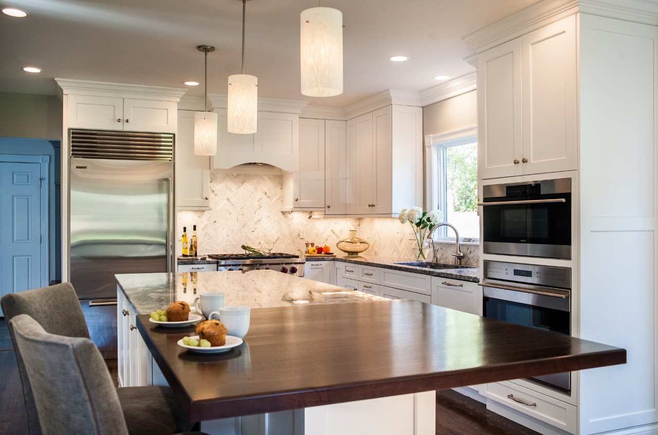
Stuart helped maximize space, organization and facilitate entertaining in a family’s butler’s pantry by including a Wolf single oven, Asko dishwasher and plenty of well-designed Inset Madison door-style cabinetry, including open shelving for platters and baking pans. The result is a bright, high-functioning room.
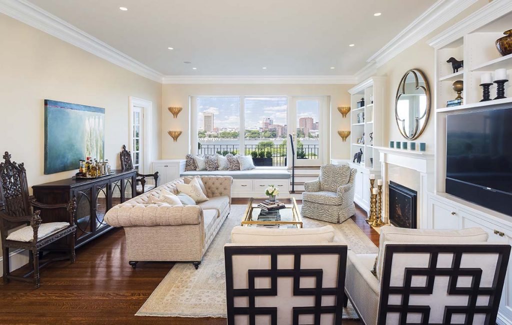
Space planning remained the key design strategy in the recent renovation of two condominiums by Lee Kimball. Both families’ children went off to college and the parents were ready to shed the extra space. Both sold their suburban homes, and one couple bought a two-bedroom unit in a brownstone overlooking the Charles River. The other couple opted for a high-level harbor view from a multi-unit building on Flagship Wharf. Both couples enlisted Lee Kimball for extensive renovations to bring the spaces up to date and customize the layouts to suit their own needs.
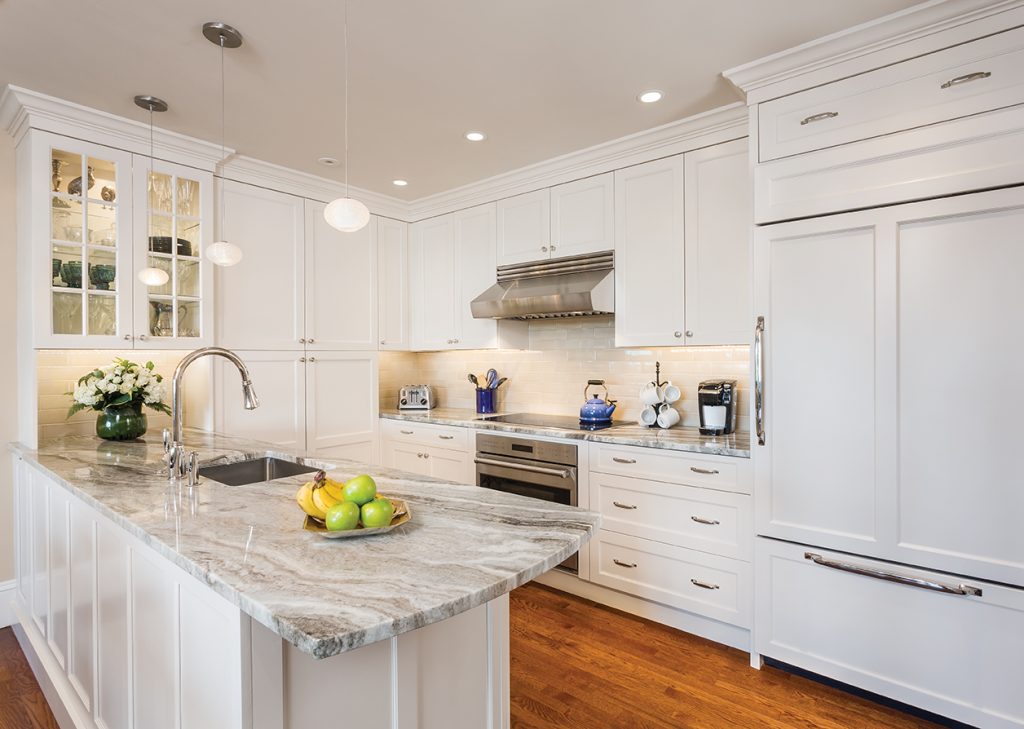
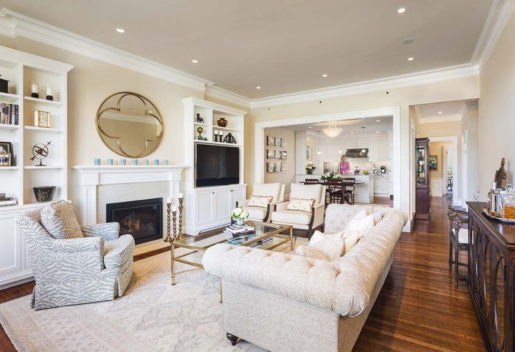
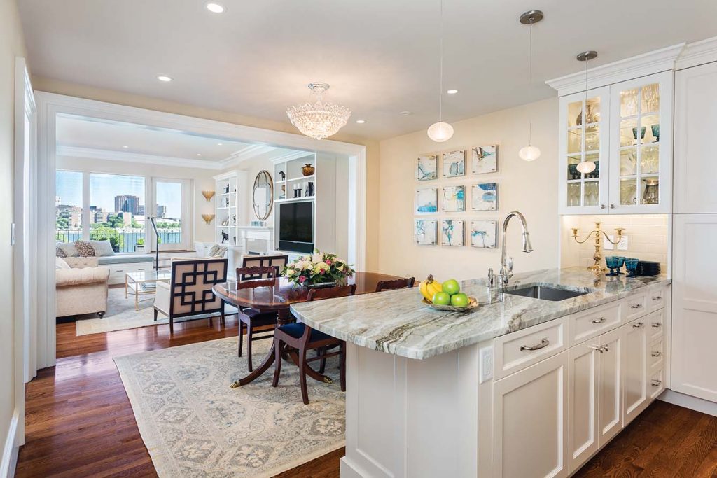
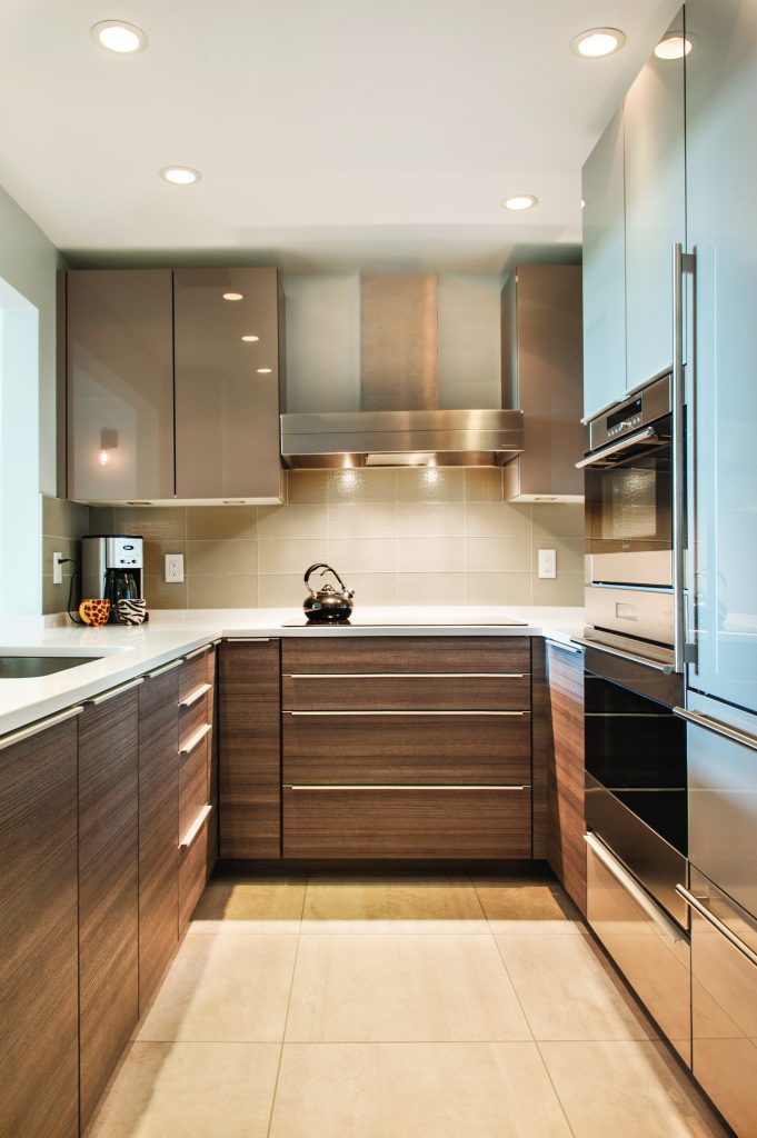
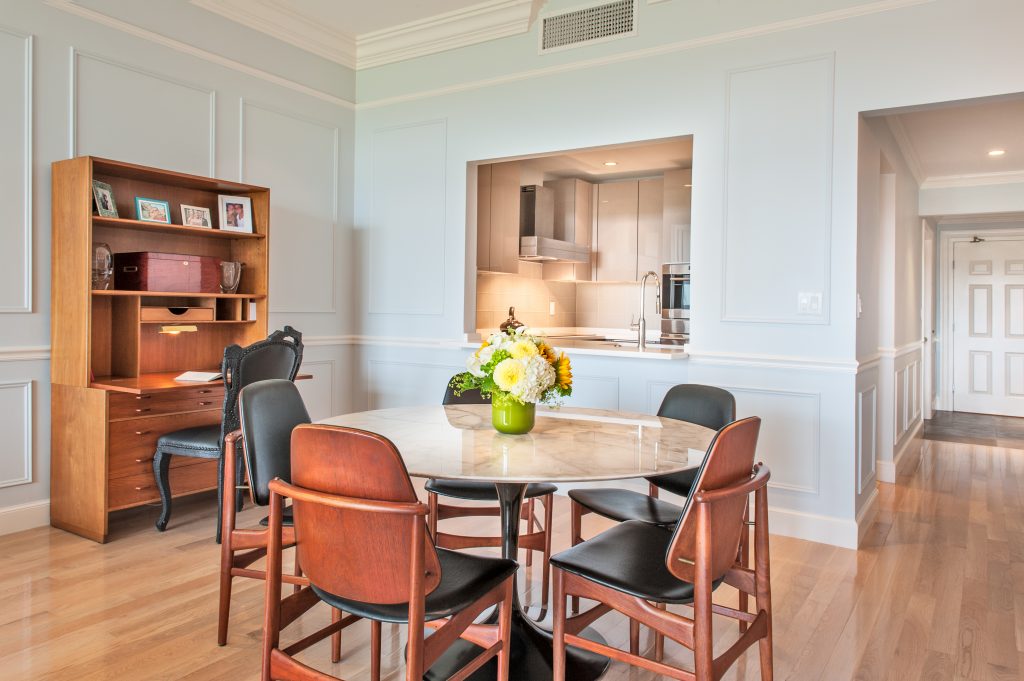
Each condominium benefited from a reconfigured floor plan. In the Back Bay unit, traffic flow, including better accessibility to the kitchen, was a priority. Lee Kimball reconfigured the entryway from a closed foyer to an open entry with access directly into the kitchen, dining room and living room. They expanded the opening between the kitchen and dining room, and installed a built-in Sub-Zero refrigerator and freezer with integrated cabinetry. The wife originally wanted a gas cooktop but “fell in love” with a Wolf induction cooktop, eliminating the need to extend gas access to the kitchen and simplifying ventilation. “The induction cooktop is a perfect solution for a city kitchen,” says Bruce Johnson, president of Lee Kimball.
The master suite suffered from an awkward layout and inadequate closet space. Lee Kimball removed the entire closet core and designed a new entry sequence. “You had to walk past the bed and fireplace to enter the bathroom,” Johnson says. “You now enter the bedroom through a laundry/transition area separate from the master bath. A shade comes down to screen the laundry and a small hallway accesses a walk-in closet and the bedroom.”
To gain valued storage space in the Flagship Wharf unit, the team took about 40 percent of space from the master bedroom and installed built-in cabinetry with a walk-in closet behind. In the bedroom, a custom platform provides extra storage, and floating side tables with glass tops enhance the airy, spacious feel. In the master bath, a floating vanity and wall-mounted toilet contribute to the open feel. Laundry is cleverly and stylishly concealed behind sliding Shohji doors; when the space is illuminated, it provides an atmospheric backlit feature.
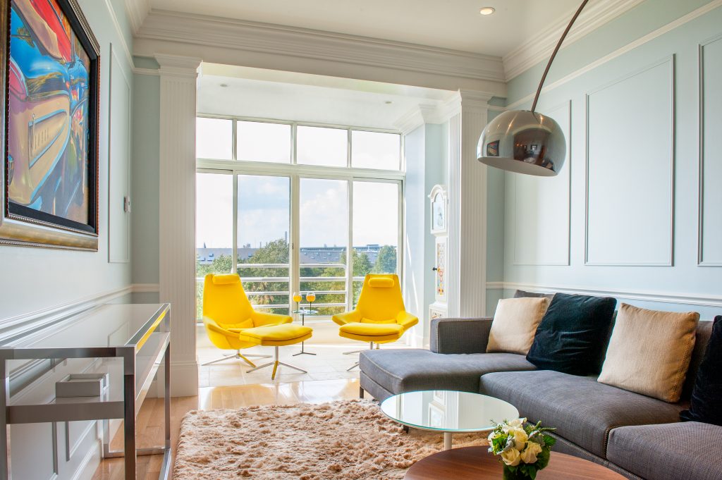
“The husband and wife wanted contemporary bathrooms and built-in furniture,” says Johnson. “They wanted to shake off traditional décor for a more modern fun tone enhanced by a pop of color via eclectic furniture.” The couple opted for the sleek contemporary look of lacquered Poggenpohl cabinetry, and also chose integrated appliances including a Sub-Zero refrigerator/freezer and a Wolf induction cooktop. A steam oven, in addition to a regular oven, replaces a microwave.
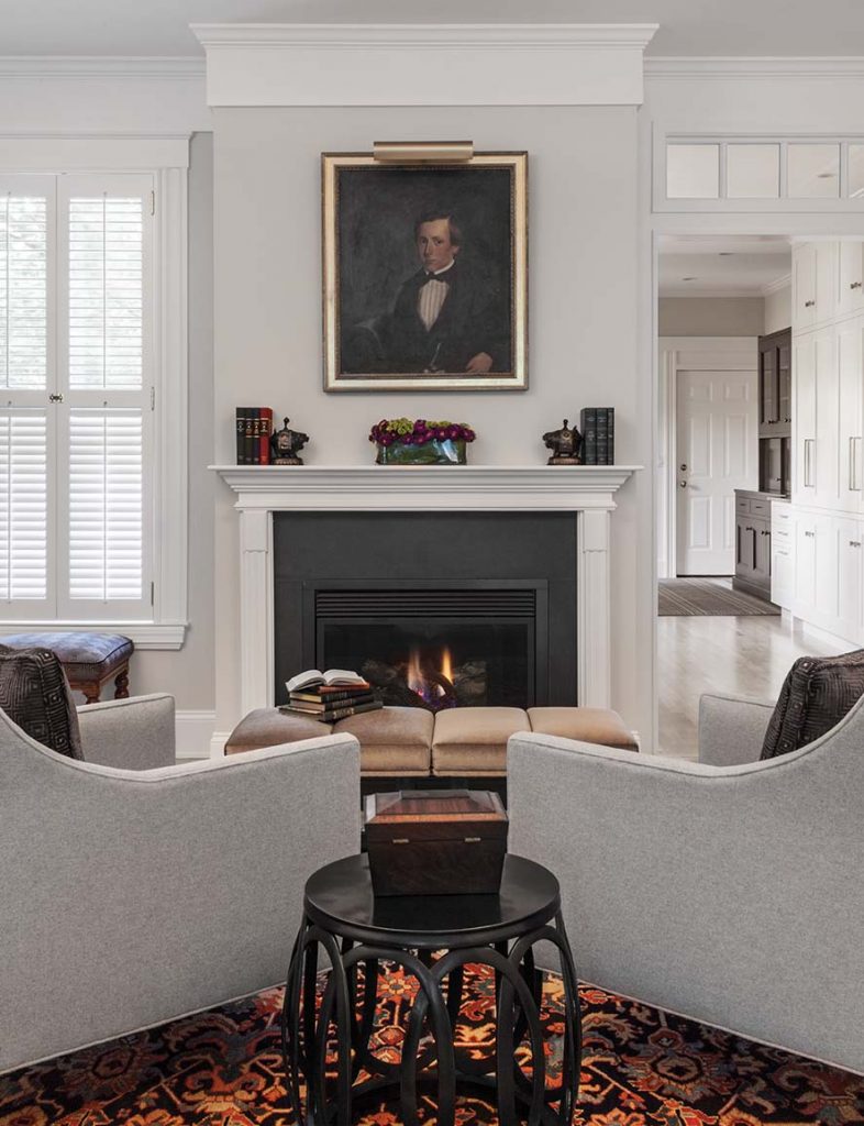
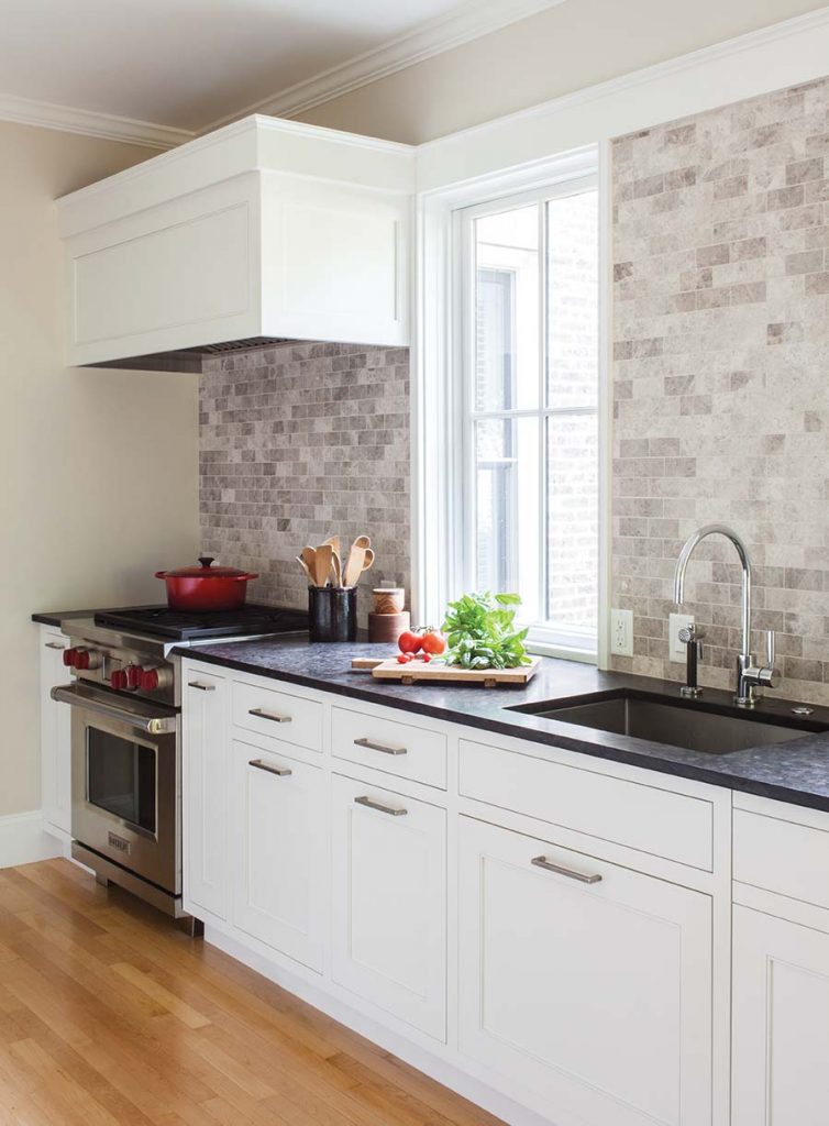
Day underscores the importance of providing “multi-use functionality whenever possible” in smaller spaces. In a professional couple’s brick row house condominium in Harvard Square, designing a kitchen with cabinetry that looked more like furniture was a requirement so that the space didn’t feel too much like a kitchen when used for work or socializing. “The cabinetry is there, but it’s tonal and background with more of a furniture feel,” says Day. “On one side of the kitchen, all of the pieces extend to the ceiling, providing overflow storage. On the opposite side with the range, sink and window, no upper cabinets allows a better sightline.”
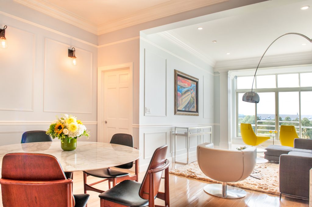
Creating a blend of two aesthetics—traditional and contemporary—was also part of the challenge in this project. Details like transoms over the doorway made the space feel more traditional, complemented by modern art, accessories and furniture. “We included old-world materials applied in a cleaner line resulting in a more pared down, less detailed profile,” says Day. “With fewer layers, the space is easier visually. Not everything needs to be the star of the show.”
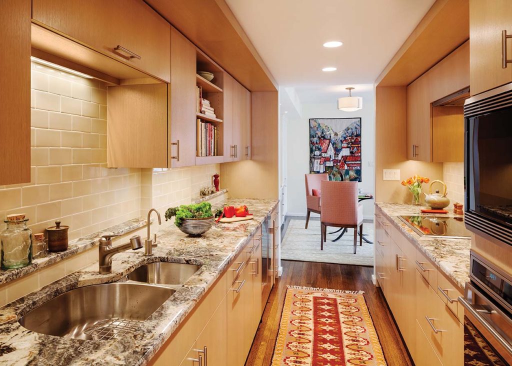
In another empty nester couple’s University Green condominium, contemporary materials were applied to a traditional layout. “This unit has a typically tight galley kitchen that’s also a connector room between the entry and dining room,” says Day. “Because it’s slightly tucked away but visible, we wanted a very restrained look. The fir cabinetry is traditional but streamlined. It has a calm, mid-century feel that is timeless.”
Throughout the unit, custom millwork provides storage. “There are no plain white walls,” Day says. “They are all built out with cabinetry that appears linear and flat.”
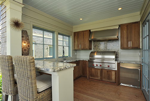
Small spaces aren’t confined to indoors, either. For entertaining al fresco, maximizing outdoor areas provides its own challenge. Stuart worked with one couple who wanted to create an outdoor kitchen open to the pool. An under-counter refrigerator with icemaker keeps everyone hydrated and the 42-inch outdoor grill by Wolf easily serves a crowd. Granite countertops don’t mind the weather and all-weather wicker stools provide a relaxing perch to enjoy and chat with the grill master. “It’s fun learning how people, cook, eat and entertain,” says Stuart. “Where people spend time together, that’s what’s interesting.”
If it’s designed right, the size of the room you gather in doesn’t really matter.
